Scatterplot with Linear Trend Demonstration
By Nathan Nguyen
May 15, 2022
Making a scatterplot with a linear trend
I’ll use the built-in Iris dataset for this demonstration
attach(iris)
data <- iris

data %>%
  ggplot(aes(x = Sepal.Width, y = Sepal.Length, group = Species)) +
  geom_point(aes(color = Species)) +
  geom_smooth(aes(color = Species), method = "lm", se = FALSE) +
  scale_color_d3() +
  labs(x = "Sepal Width",
       y = "Sepal Length",
       title = "Relationship between Sepal Length and Sepal Width by Species") +
  theme(legend.position = "bottom")

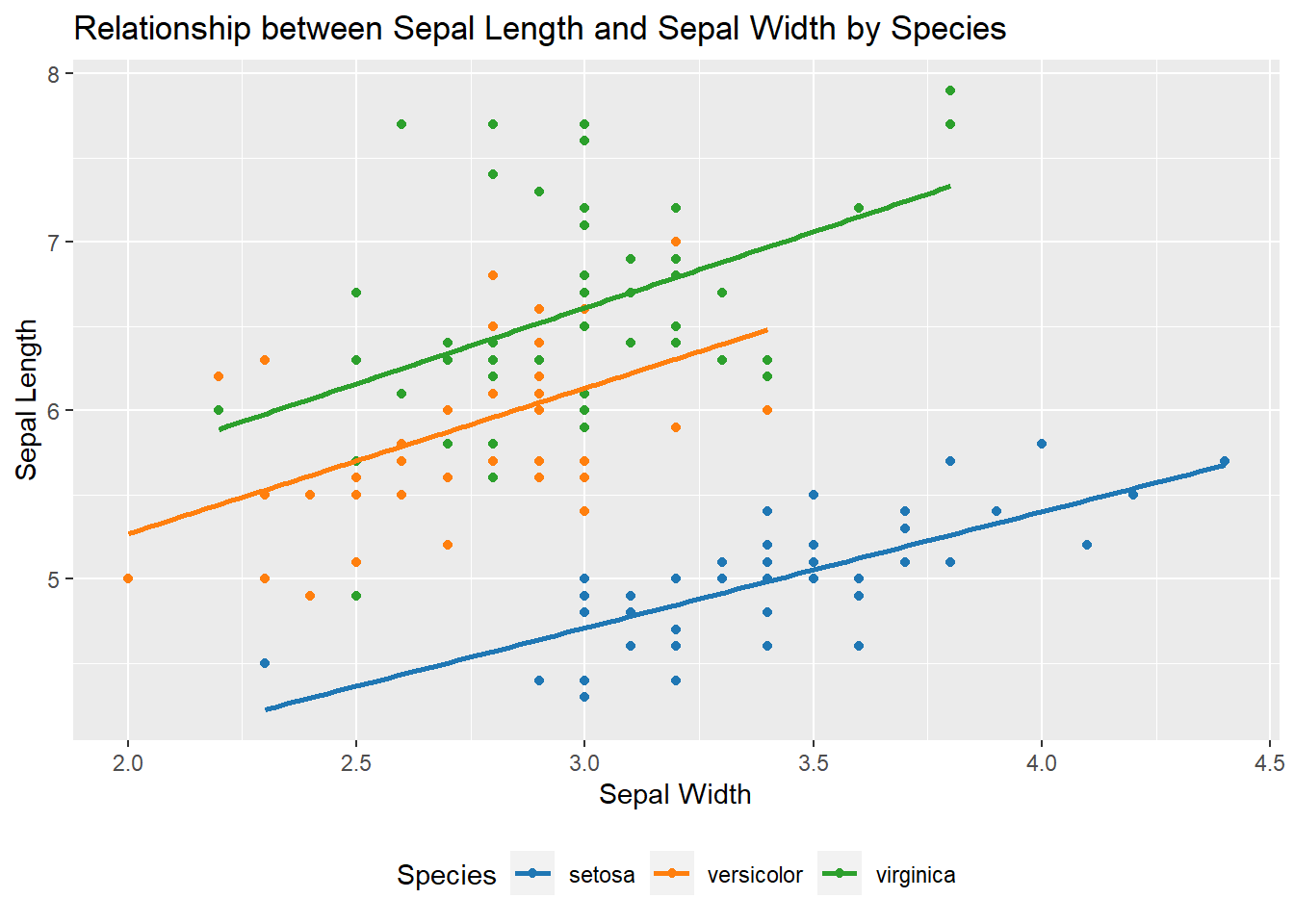
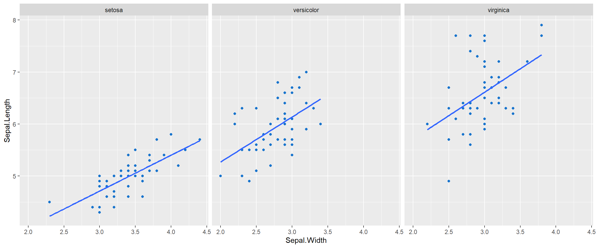
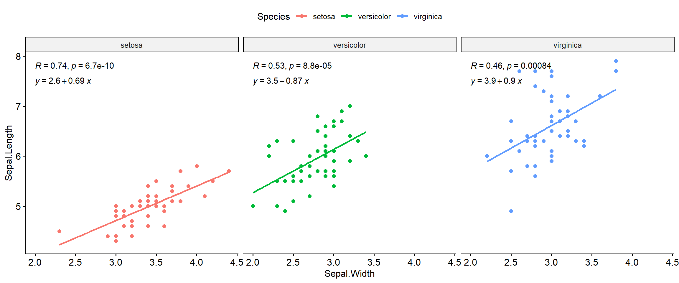
Although there is exists somewhat of a linear relationship between Sepal Length and Sepal Width, the plot looks a little cluttered. Let’s take a look at the scatter-plot for each species by creating one plot for each species. We’ll use the facet_wrap() call with ggplot. The relationship looks strongest for the setosa species and weakest for the virginica species. An individual plot will help to determine this.
data %>%
  ggplot(aes(x = Sepal.Width, y = Sepal.Length)) +
  geom_point(color = "dodgerblue3") +
  geom_smooth(method = "lm", se = FALSE) +
  facet_wrap(~Species)

# using library(ggpubr) we can add the linear trend data easily
ggscatter(
  data = data, x = "Sepal.Width", y = "Sepal.Length",
  color = "Species", add = "reg.line"
) +
  facet_wrap(~Species) +
  stat_cor(label.y = 7.8) +
  stat_regline_equation(label.y = 7.5)

- Posted on:
- May 15, 2022
- Length:
- 1 minute read, 197 words
- See Also: